Blick AI
Blick wanted to build expertise in AI and explore opportunities for user engagement. We aimed to roll out AI features quickly and iteratively improve them as we learn more about the user behavior.
Design Lead, Q4 2024 –
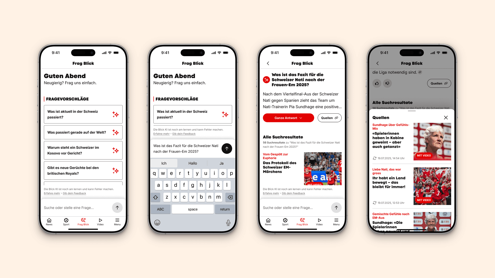
Creating a smart and instant news deep dive.
Challenge
We started with a chatbot interface that didn’t raise a lot of user interest. We now pivot into a new AI-enhanced search experience that is more in line with identified user needs. The business goal is to increase page views, which still poses a challenge as users rarely navigate further in the AI journey.
Solution
Blick AI leverages Blick articles to provide a summarized response in addition to search results. It leans into the Google/Gemini search experience to use an establishing interaction pattern, but in a news context. We want to provide users with deeper and more contextual engagement on demand.
Impacts
10% increase in session duration when using the suggested questions feature
20% more page views for sessions using the AI-enhanced search
96% of MVP AI input interactions only entered a single query
All quantitative metrics have been anonymized or modified to protect sensitive business information.
My Contributions
UX Research, UX Strategy, UX Design, UI Design, Design System, Design Handoff, Stakeholder Management
Team
PM, PO, Tech Lead, Web/iOS/Android Developer, Backend Engineer, Business Analyst
Blick AI
Blick wanted to build expertise in AI and explore opportunities for user engagement. We aimed to roll out AI features quickly and iteratively improve them as we learn more about the user behavior.
Design Lead, Q4 2024 –
Creating a smart and instant news deep dive.
Challenge
We started with a chatbot interface that didn’t raise a lot of user interest. We now pivot into a new AI-enhanced search experience that is more in line with identified user needs. The business goal is to increase page views, which still poses a challenge as users rarely navigate further in the AI journey.
Solution
Blick AI leverages Blick articles to provide a summarized response in addition to search results. It leans into the Google/Gemini search experience to use an establishing interaction pattern, but in a news context. We want to provide users with deeper and more contextual engagement on demand.
Impacts
10% increase in session duration when using the suggested questions feature
60% of the user asked general knowledge questions
96% of MVP AI input interactions only entered a single query
All quantitative metrics have been anonymized or modified to protect sensitive business information.
My Contributions
UX Research, UX Strategy, UX Design, UI Design, Design System, Design Handoff, Stakeholder Management
Team
PM, PO, Tech Lead, Web/iOS/Android Developer, Backend Engineer, Business Analyst
Blick AI
Blick wanted to build expertise in AI and explore opportunities for user engagement. We aimed to roll out AI features quickly and iteratively improve them as we learn more about the user behavior.
Design Lead, Q4 2024 –
Creating a smart and instant news deep dive.
Challenge
We started with a chatbot interface that didn’t raise a lot of user interest. We now pivot into a new AI-enhanced search experience that is more in line with identified user needs. The business goal is to increase page views, which still poses a challenge as users rarely navigate further in the AI journey.
Solution
Blick AI leverages Blick articles to provide a summarized response in addition to search results. It leans into the Google/Gemini search experience to use an establishing interaction pattern, but in a news context. We want to provide users with deeper and more contextual engagement on demand.
Impacts
10% increase in session duration when using the suggested questions feature
20% more page views for sessions using the AI-enhanced search
96% of MVP AI input interactions only entered a single query
All quantitative metrics have been anonymized or modified to protect sensitive business information.
My Contributions
UX Research, UX Strategy, UX Design, UI Design, Design System, Design Handoff, Stakeholder Management
Team
PM, PO, Tech Lead, Web/iOS/Android Developer, Backend Engineer, Business Analyst
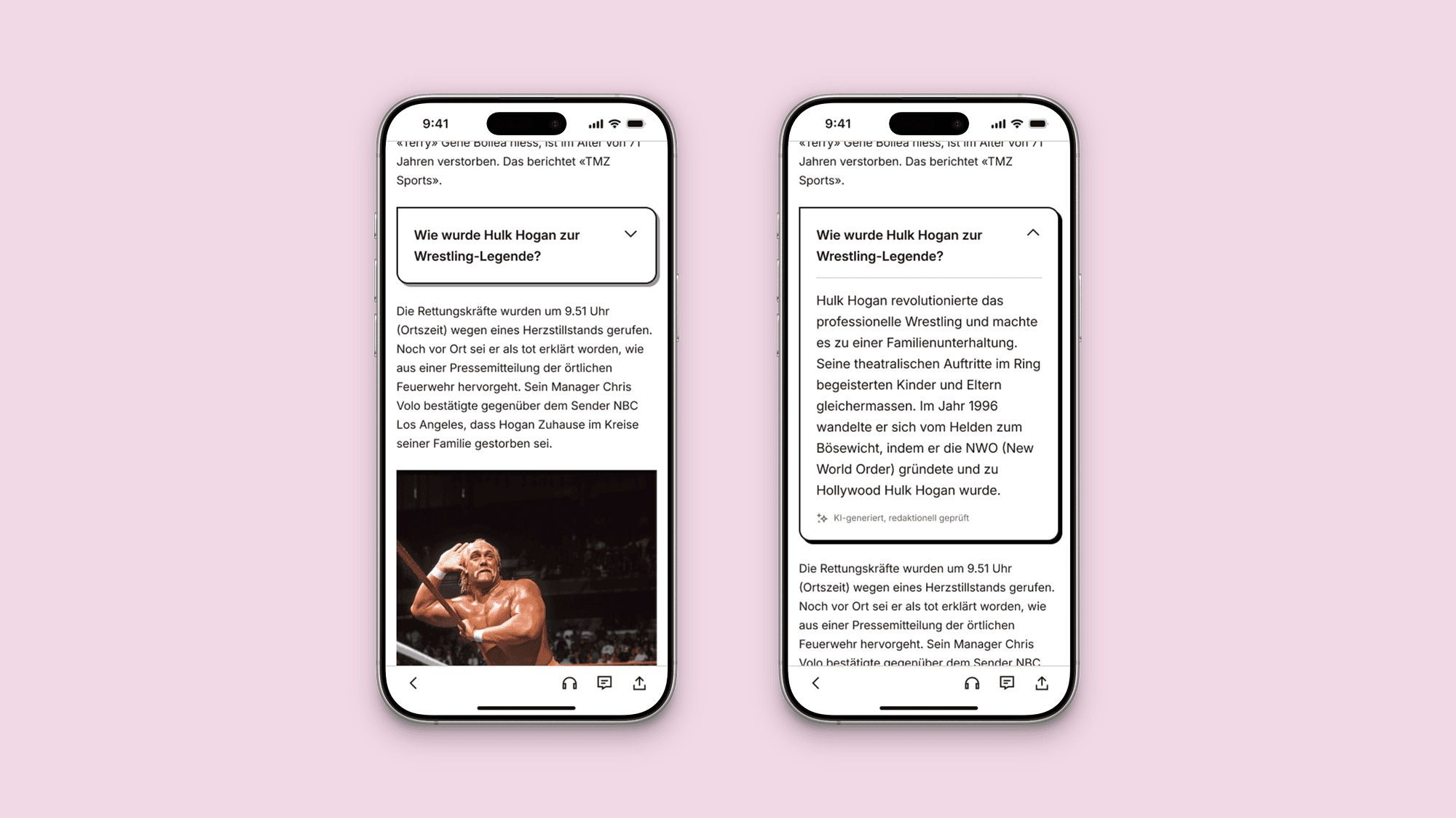
AI-enhanced articles.
AI-enhanced articles.
We're exploring the TL;DR widget to improve our long-form article templates. Designed as a navigational aid for direct traffic users, this smart tool aims to increase session durations and follow-up page views, boosting content discoverability and user engagement.
Your personalised news frontpage.
Your personalised news frontpage.
We're exploring the TL;DR widget to improve our long-form article templates. Designed as a navigational aid for direct traffic users, this smart tool aims to increase session durations and follow-up page views, boosting content discoverability and user engagement.