Blick.ch Redesign
The redesign overhauled the user experience, improved content discovery, increased user engagement, and offered better recirculation beyond the homepage. Additionally, we introduced 70% more ad monetization opportunities to counter a stagnating market without adding more friction for users.
Design Lead, Q1 2023 – Q4 2024
Reimagining the news experience and ad strategy.
Challenge
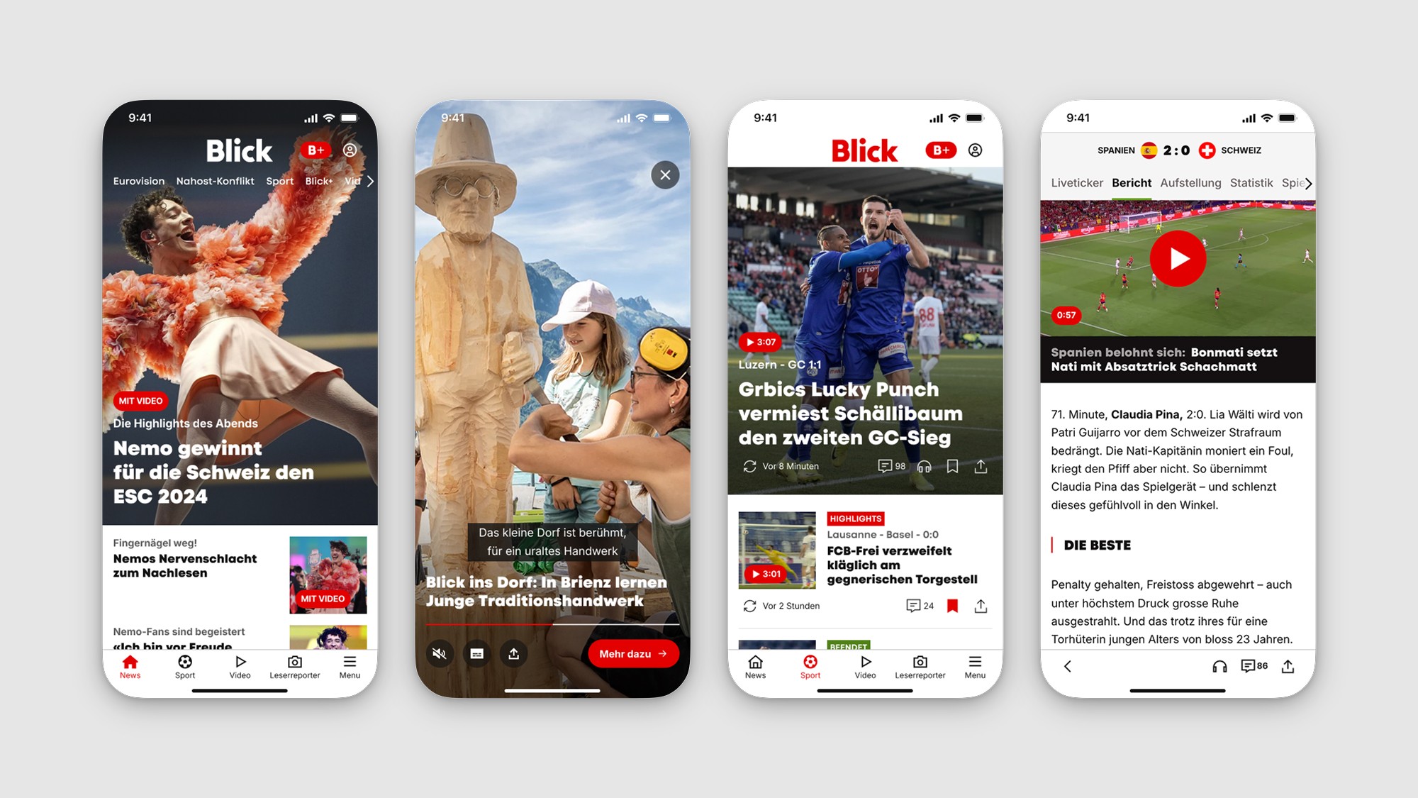
The Blick.ch news platform faced an overcrowded homepage, leading to 80% of traffic being confined to it, and users dropping off at just 25% down the page. A shallow “snacking” home>article>home user journey limited content discovery. Additionally, a dwindling advertising market threatened the existing monetization strategy.
Solution
The redesign overhauled the user experience, improved content discovery, increased user engagement, and offered better recirculation beyond the homepage. Additionally, we introduced 70% more ad monetization opportunities to counter a stagnating market without adding more friction for users.
Impacts
25% increase in scroll depth
10% increase in session duration
10% decrease in video views
All quantitative metrics have been anonymized or modified to protect sensitive business information.
My Contributions
UX Research, UX Strategy, UX Design, UI Design, Workshop Facilitation, Design System, Design Handoff, Stakeholder Management
Team
CPO, CCO, Editor-in-Chief, Head of IT, PM, PO, Tech Lead, Web/iOS/Android Architects, Developers, External Design Agency
Blick.ch Redesign
The redesign overhauled the user experience, improved content discovery, increased user engagement, and offered better recirculation beyond the homepage. Additionally, we introduced 70% more ad monetization opportunities to counter a stagnating market without adding more friction for users.
Design Lead, Q1 2023 – Q4 2024
Reimagining the news experience and ad strategy.
Challenge
The Blick.ch news platform faced an overcrowded homepage, leading to 80% of traffic being confined to it, and users dropping off at just 25% down the page. A shallow “snacking” home>article>home user journey limited content discovery. Additionally, a dwindling advertising market threatened the existing monetization strategy.
Solution
The redesign overhauled the user experience, improved content discovery, increased user engagement, and offered better recirculation beyond the homepage. Additionally, we introduced 70% more ad monetization opportunities to counter a stagnating market without adding more friction for users.
Impacts
25% increase in scroll depth
10% increase in session duration
10% decrease in video views
All quantitative metrics have been anonymized or modified to protect sensitive business information.
My Contributions
UX Research, UX Strategy, UX Design, UI Design, Workshop Facilitation, Design System, Design Handoff, Stakeholder Management
Team
CPO, CCO, Editor-in-Chief, Head of IT, PM, PO, Tech Lead, Web/iOS/Android Architects, Developers, External Design Agency